Where To Find Colour Palette Inspiration For Your Branding
The most noticeable part of a brand is its colours. The colours a company chooses can play a huge role in creating a good first impression. They can attract the right audience and create the ideal association between emotions and a product or service.
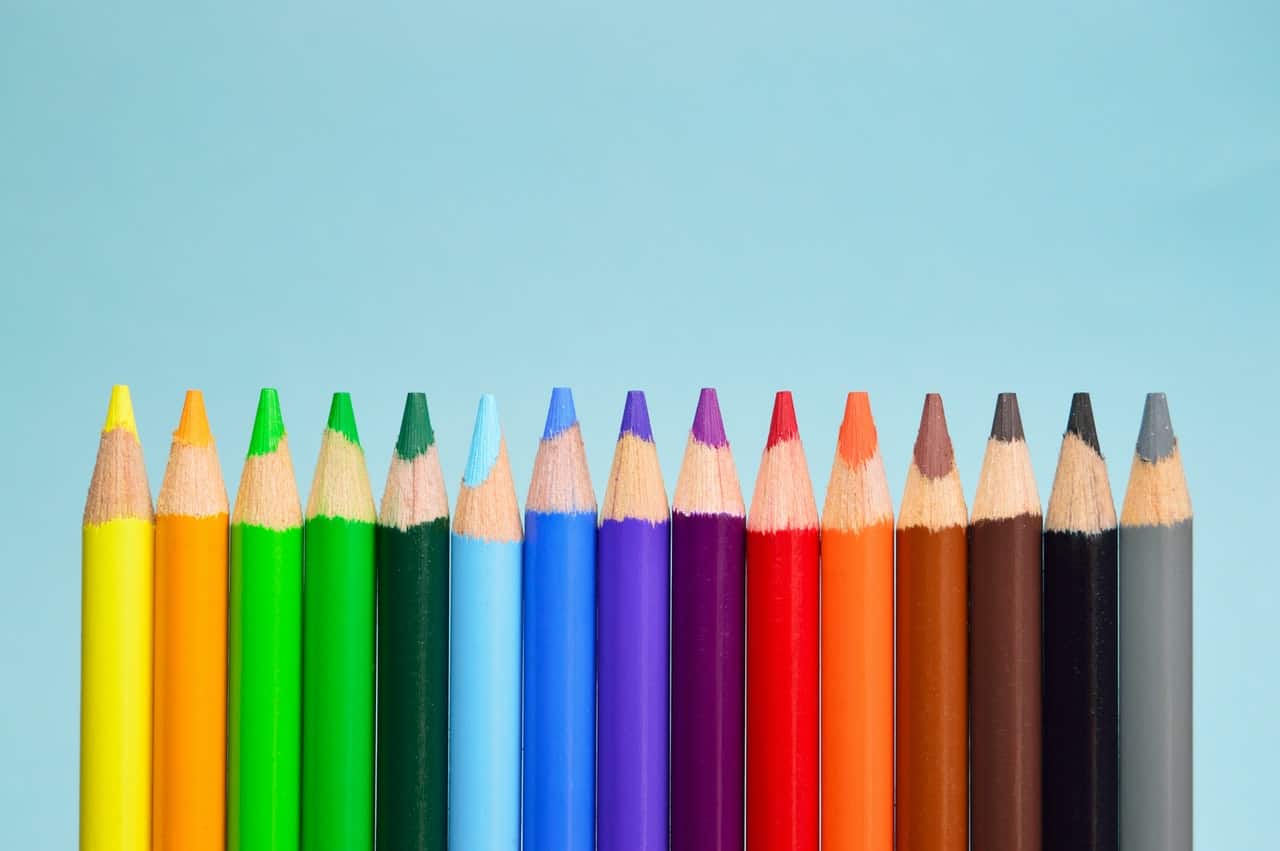
Coming up with the ideal colour palette is a challenge for many entrepreneurs developing their brands. It won’t only be used in the logo: the colours will determine the look of your website, advertisements, social media, and business cards. Here’s how you can find inspiration and choose the right palette for your small business!
The Psychology Of Colour 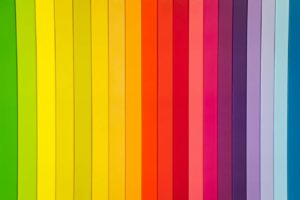
What makes colour such a powerful communication tool is how it influences our moods, taps into our emotions, and encourages us to take action. These associations can tell you how customers will see your brand:
- Black is a serious colour people associate with elegance, luxury, authority, and power. Think of how deluxe a “black credit card” sounds! It can also evoke tradition and class.
- Blue connects with trustworthiness, loyalty, security, and serenity. Many products use blue to highlight cleanliness (it’s very popular in detergents) and the air, sea, and sky. Most men also prefer it.
- Brown is a simple, utilitarian colour that many consumers associate with roughness, no matter what the shade. But they also see it with warmth, depth, and comfort. Think of that old UPS slogan: “what can brown do for you?” You can use brown in many surprising ways!
- Green symbolizes growth, safety and balance for many consumers. Thanks to American banking commercials (and the colour of their money), dark green goes with banking and finance. On the flip side, green is nature, and it’s the best colour for eco-friendly products.
- Orange is energetic and warm, much like sunshine! Consumers associate this colour with lightheartedness, creativity, youth – as well as affordability.
- Pink is femininity and romance – there’s no doubt about that. But many companies are using pink in bolder ways to flip our associations and stand out. It’s also seen as a gentle, innocent, and appreciative colour.
- Purple has many historical associations with royalty, and today, it’s still seen as a luxurious, extravagant colour. It’s also seen as a mysterious colour, most likely because it’s so rare in nature. If you’re capitalizing on nostalgia, it’s said to create these feelings in consumers.
- Red is a colour with some major contrasts: from positive emotions like love, passion, and desire to (potentially) negative emotions like war and power. Above all, red helps a logo stand out and capture attention – think of all the logos in the food industry that use a bright red.
- Yellow is an attention-grabbing colour people associate with positivity and happiness; they can also perceive it as cautious, lighthearted and childish. This is why it’s not used in ads for cars or men’s clothing.
It’s not only the colours; you also have to think about their various tints, tones, and shades:
- Tints are made by adding white to the colour. This makes them lighter, and a tinted colour is a more peaceful and feminine one.
- Tones, by contrast, add black and white to the pure colour to bring down the intensity.
- Shades are created by mixing in black. Shades communicate a feeling of mystery and masculinity.
Who Are You?

After reading the psychological associations with each colour, you might have one or two colours in mind for your brand. The next step is to look for images that use these colours in ways that reflect your vision. A good tactic is to use an idea board: either a physical board on which you pin inspiring photos or a private Pinterest account.
Choose images that reflect your brand goals, target audience, and your personality as a small business owner. Deciding these will help you identify your brand’s essence and narrow down the ideal colours.
Think about it: are you bold and confident? Positive and fun? Feminine and flirty? A colour palette can create these associations for your audience. Keep in mind common associations before committing, though. Black and orange or red and green might seem nice, but their associations with seasonal decorations might strike the wrong chord.
Don’t Be Afraid To Look At The Competition.
Don’t discount the power of colours to a big business’s success. You can include the branding and ads of major competition in your idea board to get a feel for how colours work to create feelings. Remember not to copy: you’re trying to stand out, not get lost in the crowd!
Select The Palette
With all this knowledge behind you, you’re ready to choose your colour palette! This isn’t one or two colours – you need a wide selection of swatches, tints, tones, and shades to work on all your branding points. Make sure that every hue is selected to have the desired effect on your potential audience, so test them out in different mediums to see how they look. You don’t want colours to work on your Facebook account only to look amateurish on a business card.
Once you’ve chosen the palette, don’t stray from it. Branding is all about uniformity, and audiences will notice when something is off! If you’re having trouble choosing your colours, come to the branding experts at SlyFox. We’ll talk with you about your small business goals and help you come up with a palette that works towards them!